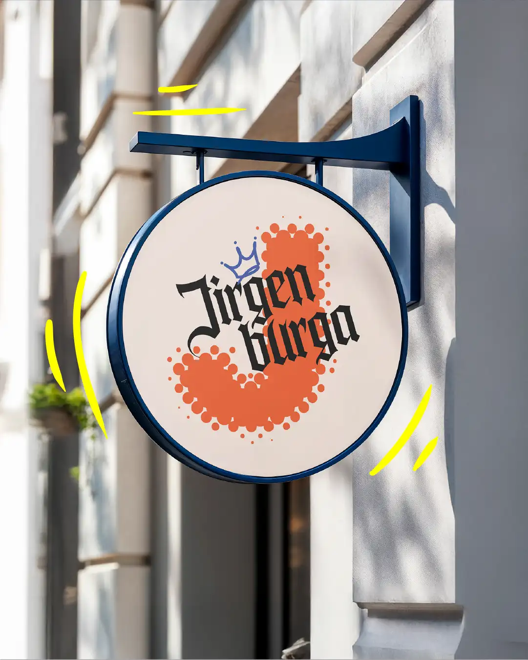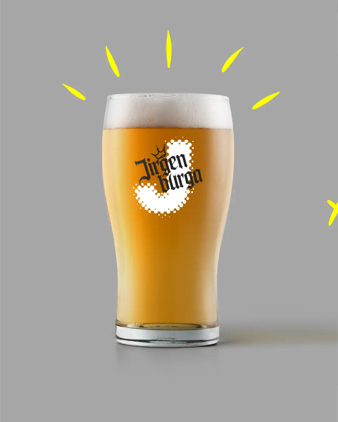
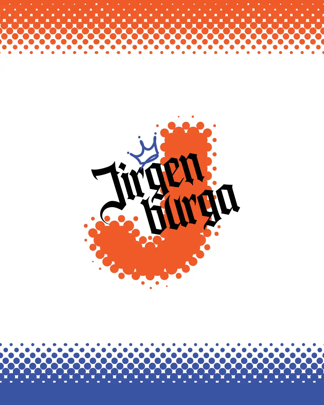
Es izveidoju šo logotipu jaunam alus brūzim ar nosaukumu Jirgenburga — nosaukums radies no viduslaiku pils, tāpēc vēlējos, lai zīmols būtu ar vēsturisku pieskaņu, bet vienlaikus moderns.
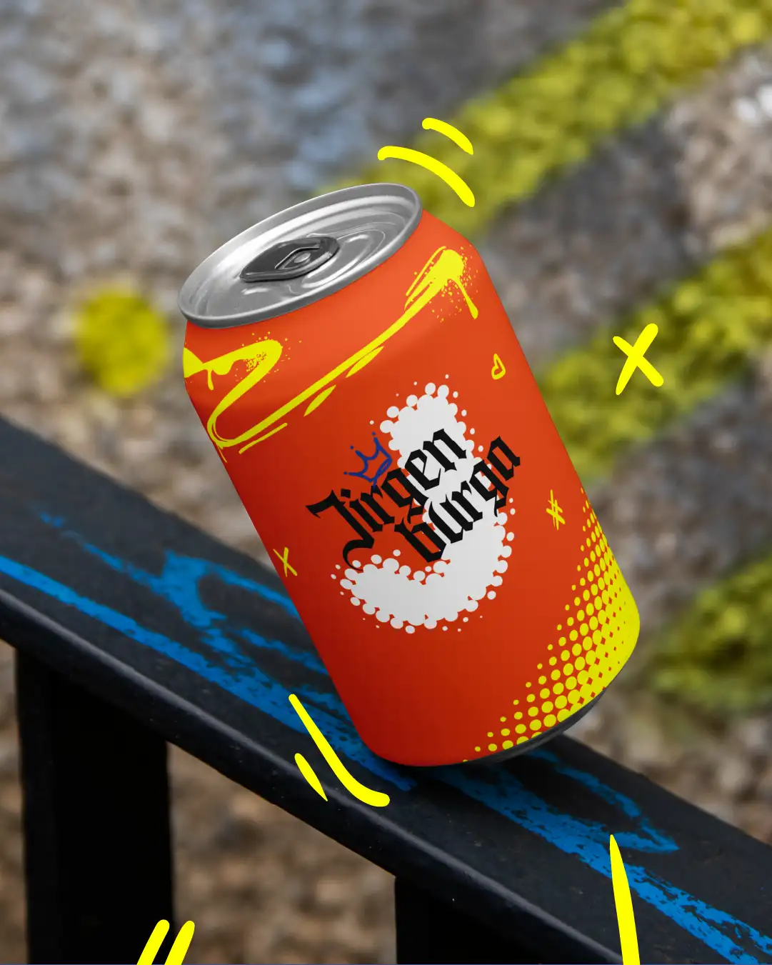
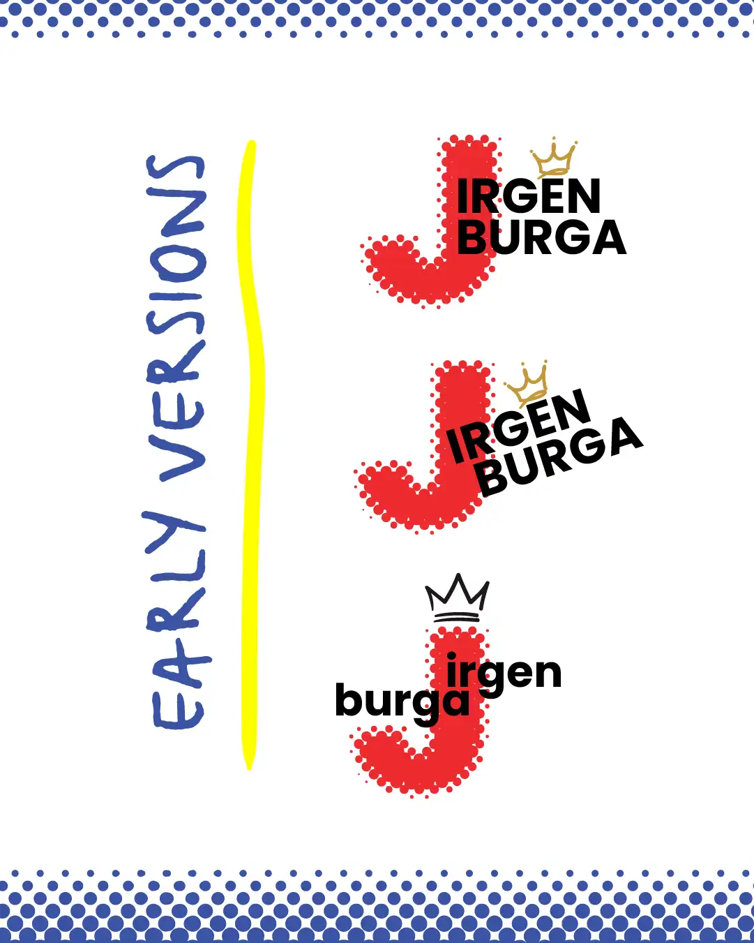
Izvēlējos vecskolas burtveidolu, lai radītu viduslaiku alus brūvēšanas sajūtu, bet tad pievienoju treknus, grafiskus elementus — piemēram, pus-tēna “J” formu un rotaļīgu kronīti —, lai padarītu to svaigu un viegli atpazīstamu. Ideja bija sajaukt vēsturiskās noskaņas ar jaunās paaudzes enerģiju, lai tas izceltos alus pasaulē un labi izskatītos gan uz snapback cepurēm, gan uzņēmuma busiņa.
Alus zīmols ar vēsturi —
bet radīts mūsdienām.
I created this logo for a new brewery
called Jirgenburga — the name comes from a medieval castle, so I wanted the brand to feel rooted in history but still hit with a modern vibe.
I went with an old-school typeface to bring in that medieval brewing feel, but then added bold, graphic elements — like the half-tone “J” shape and a cheeky little crown — to make it feel fresh and recognizable. The idea was to mash up historical vibes with new-school energy so it stands out in the beer world and looks just as good on a snapback or a company van.
A beer brand with history —
but built for the now.
Kronis tika pievienots ne tikai stila dēļ, bet arī tāpēc, ka esmu ļoti ieinteresēts ielu kultūrā un vēlējos to ieviest arī zīmola dizainā.
A crown was added not just for style, but because I’m really into street culture and wanted to bring that influence into the branding.

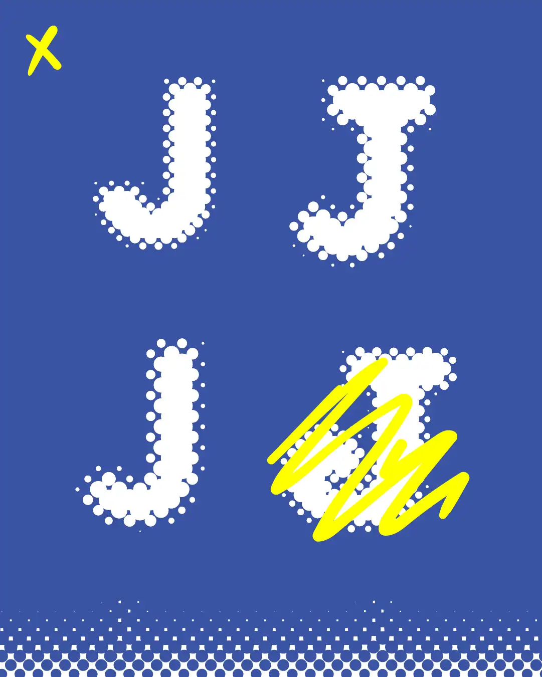

Lai labāk saprastu, vai kas strādā vai nē, es parasti ievietoju savu darbu maketos, lai digitālais dizains iegūtu reālistiskāku sajūtu.
Tādā veidā varu redzēt reālus piemērus un pielāgot elementus, kas izceļas.
To better understand if something is working or not, I usually insert my work into mockups to get a real-life feel of the digital design.
That way, I can see realistic examples and tweak the elements that stand out to me.